Lighting Techniques for Great Photo-realistic Rendering in Ashlar-Vellum 3D Modeling Software
Rendering within 3D modeling software is all about simulating the real world as much as possible. If you are rendering something sitting on your table, think about everything that is going on in the room. What is around the object? Where is the light coming from? Is there light coming from different places around the room? How bright is it? What color is the light? What do the shadows look like? What is reflecting in the object? What kinds of highlights are on the object? All of these things are the result of lighting and the environment. Novice users often don’t take the time to consider these things and then try to replicate them. It’s no wonder most beginners’ renderings don’t look very good.
Lighting and the scene are the most important things to start with when setting up a rendering for a 3D model. Once the lighting and the environment are correctly set up, everything else falls into place.
Let’s start our discussion with setting up basic lighting, how, and why. Photographers have known about the importance of light for a very long time, and they have developed some reliable techniques for setting up good lighting in a photography studio. Virtually all of a photographer’s techniques are used in 3D rendering.
We’ll start with a discussion of light types and how to set up your model. Then we’ll move on to the most basic setup, called the 3-point light setup. Most rendering starts with this setup, and then evolves into more advanced lighting setups. We’ll talk about those more advanced set ups later in this article.
Lighting Types
There are three basic types of lights in Cobalt, Xenon and Argon. Here are some examples of what each one does, and how or why to use each type. They can each be used in variations of the lighting setup we are about to learn.
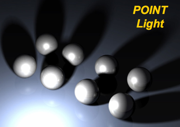
Point lights are like light bulbs where the light emanates in all directions from a central spot. Notice how the shadows go off in different directions. Also notice how the shadows become softer the further from the object they get.
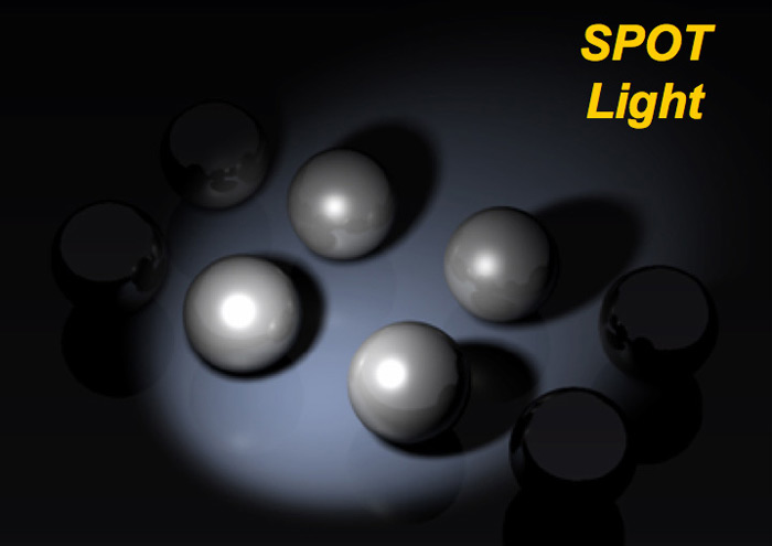
Spot lights can be aimed, like a flashlight, and have similar shadow qualities to the point light. Spot lights focus the light onto one area.
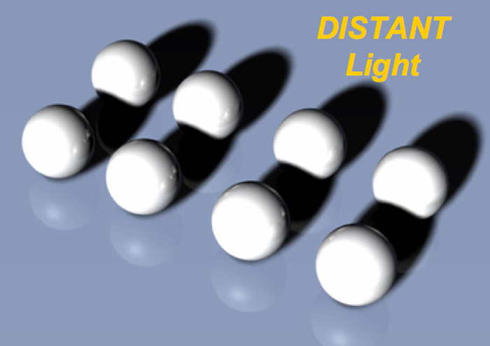
Distant lights are different, however. These are meant to simulate outdoor sunlight. They have very few settings, cast even light throughout the scene, and the shadows all go in the same straight direction.
Setting up the Model
To get started, create or open an existing object. Don’t worry about any materials on the object. Make sure to add a simple floor under your object by creating a large rectangular surface or thin block.
Be sure to turn off or delete any existing lighting in the file you may have. In Cobalt, Xenon and Argon this happens automatically when you add your first light from the lights palette. One light, however, is left on, which is the ambient light. The settings for this are found under the View>Ambient Light Settings. Just turn the slider all the way to zero to shut this light off.
Now you’re really ready to begin the light setup.
Step 1: Add your first light, the main light or the KEY light.
The Key light provides the primary lighting for the object and scene. It should generally be the brightest.
Start with the Point light. This is the simplest and most basic light to use and understand. Remember, it is like a light bulb, where light emanates in all directions out from the center.
When placing this light, consider where you would like most of the light on your object, and likewise, where the main shadow will fall. For example, will the main lighting be from the left of the object with the shadow falling to the right, or will the light be on the right with the shadow falling to the left? Usually this light should be situated fairly high above the model, around 45 to 60 degrees relative to the ground, if you were to draw an imaginary line from the center of the light to the center of the object and then measure the angle.
As mentioned, this light should be very bright, but also consider the shadow. Sharp-edged shadows don’t usually look very realistic, so set the light’s shadow to be either medium or soft on the shadow settings.
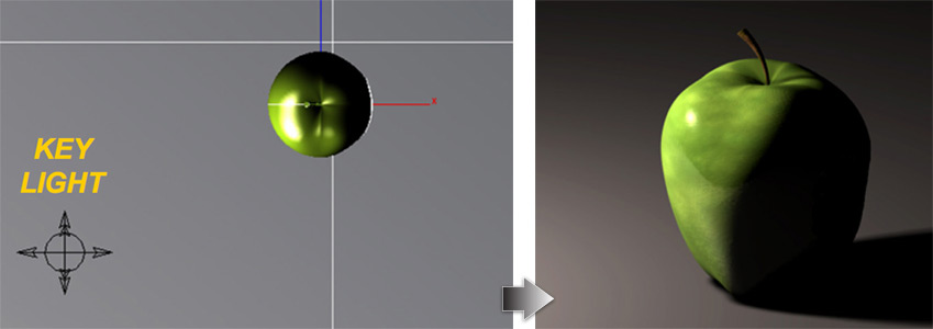
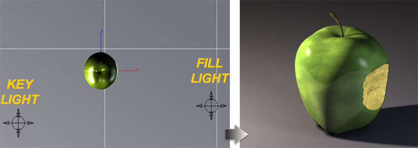
Step 2: Add a secondary light, called a FILL light.
Since the main light will now cast a very harsh, dark shadow and a high contrast between the lit and unlit sides of the object, the fill light comes to the rescue to brighten those dark areas a bit.
Use the point light again and place it somewhere on the dark side of the object so that it brightens that area. This light should not be too bright because you do not want to overpower the main light or wash out the object. Generally you should make this light about 1/4th the overall brightness of the main light.
Place this light lower than the main light, somewhere around 25 to 40 degrees above the object.
Make the shadows on this light either soft or completely blurry. This will give a nice subtle, secondary shadow, but won’t over power the main shadow.
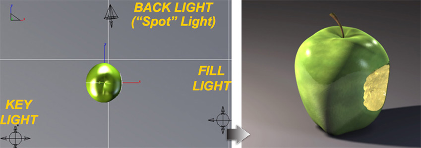
Step 3: Add a third light, called a BACK light or RIM light.
This light is actually somewhat optional, but it can have a very important purpose and add a lot of depth and dimension to the rendering. As it’s name suggests, this light is meant to be placed behind the object, and its purpose is to create a highlight or rim along the top, back edge of the model. Think of a crescent moon as a good example. The reason for doing this is that it helps add a three dimensional feel to the model, and also helps make the model stand out from the background, especially if the background is dark.
Use the point light for this and place it somewhere on the back side of the object so that it creates a highlight area along the back and top of the object. This light can be bright, possibly even as bright as the main light. Just make sure that it doesn’t cause a shadow that competes with the main shadow. Sometimes it is helpful to shut the shadow off altogether on this light.
This light should be fairly low so that it will skim the top of the object. You may have to experiment with the placement a bit to get it just right.
That’s it. This is the basic 3-point light setup.
Next, let’s explore lighting, settings for the lights, and other lighting setups in more depth.
Using the Spot Light
The Spot light is often a good choice for the back light. It was used in the previous images in this article. For example, let’s imagine your scene had a wall behind the object. In this rendering you decide not to have much light cast onto that wall. If you used the Point light for the back light, then a lot of light would be shining onto the wall, since light from a point light goes in all directions. To prevent this use a light that can be aimed, such as the Spot light.
Use the drop down menu in the Edit Objects dialog box to change the back light that’s currently in the scene to the Spot Light option.
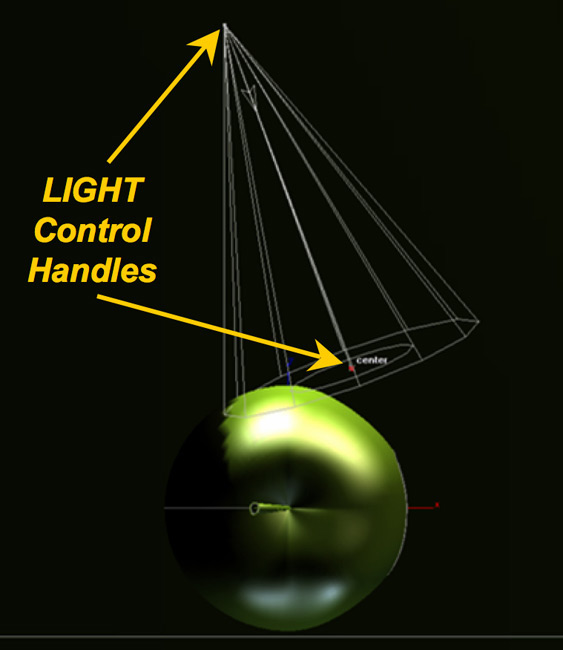
In order to aim the light, select the light and turn on control handles for the light.
Use Edit>Show Points just like you do with other objects in Ashlar-Vellum software, such as lines or splines. Now you will see some control points on the light that can be selected and dragged. Select the one that is out in front of the light, and then drag that until it points where you want it.
Next let’s talk about some of the other options that are available for the lights.
Attenuation Settings
In the real world, light decreases in brightness the further away from the source it gets. In rendering, this is simulated and referred to as attenuation or fall-off.
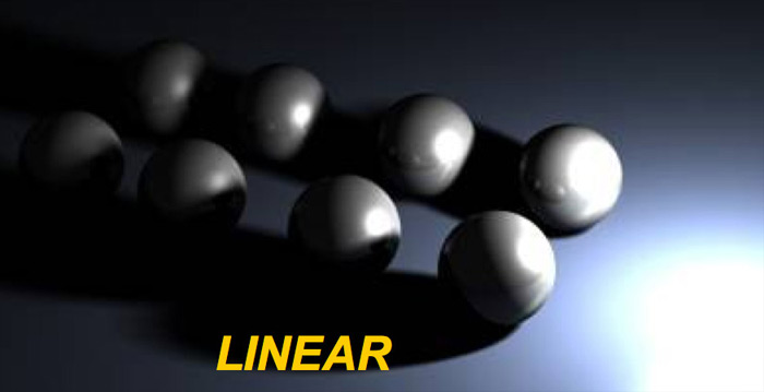
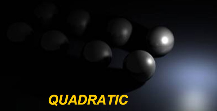
In Ashlar-Vellum software, there is an attenuation option in the Edit Objects dialog, with 3 main settings: None (the default), Linear, and Quadratic. Actually, there are two versions of the linear and quadratic settings called clamped or unclamped, which are meant for small or large scenes. In truth though, you will very rarely be able to visually see a difference in most renderings, so for simplification, we just need to know the difference between the settings None, Linear, and Quadratic.
To get right to the point, Linear is the setting used most of the time in general renderings. This is the setting used in the previous apple renderings. It simulates a steady, even fall-off in the brightness of the light throughout the scene. The default option of None is not very realistic since the light brightness does not change no matter how far it is from the source. This setting tends to wash-out the rendering with too much light, so Linear is usually the best choice.
Quadratic concentrates the light to a small area, and the light very quickly diminishes to nothing. Good uses for this setting are special situations like an LED or glowing display panel, where you do not want the light to brighten the overall scene, just make a small area appear to glow.
Spot Light Options
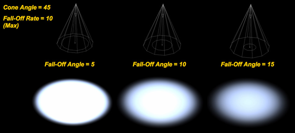
The Spot light has additional options that the other lights do not. It has options for Cone Angle, Fall-off Angle, and Fall-off Rate. Basically a spot light will be brightest in the center, and then fade to no light at the edge of the light cone. That’s what these settings control.
Cone Angle = The overall angle of the outer light cone.
Fall-Off Angle = The angle between the outer cone and one side of the inner cone.
Fall-Off Rate = How fast the light fades from full brightness at the center to no light at the edge (the gradient).
Advanced Setups
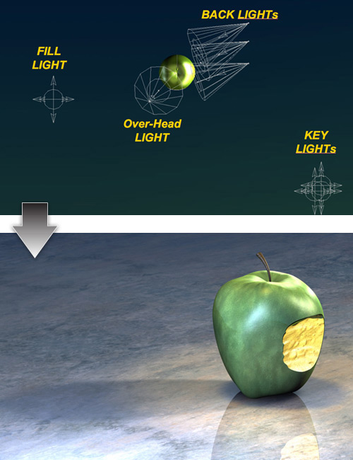
Here is an example of how the 3-point light setup progresses into more advanced setups. It’s the same basic concept, except there are now multiple lights used for the Key light, as well as multiple lights for the backlight.
The reason for using multiple lights in a cluster for the key light is that it helps produce better highlights as well as more realistic shadows.
The shadows have a darker area underneath the object, plus they fade out more as they get further away from the object. The multiple backlights are used to create a more dramatic and even rim of light along the back of the object. Additionally, this scene has added an extra over-head light to simulate an overhead source such as a hanging lamp. The lights have also been slightly colored.
Here is what the final rendering with textures looks like with that lighting setup.
In closing, below is a teaser of some new types of lights that will be coming to version 8 of the Ashlar-Vellum Cobalt, Xenon and Argon 3D modeling products.
Lighting is only the first step in creating great photo-renderings. Other factors that make great photo-renderings include scenes and environment, and materials. Both topics are too large to be included here, but will be covered in future articles in the Design Explorer.
